
Team Iowa Physical Therapy
Brand identity and collateral created for the Team Iowa Physical Therapy, a new physical therapy practice established by Joe Nelson—one of the best physical therapists and kindest humans on the planet—in early 2017. Joe came to Meld with a vision for his new company: a name, Team Iowa, and the color red. Together, we crafted a brand that spoke directly to the individual seeking treatment, with a modern look and feel inspired by vintage athletics but approachable for anyone.
The Team Iowa strike, a stylized backslash, was developed out of initial concepts for a pennant-style logo and provides a vibrant red burst of action to the wordmark.


A stacked version of the logo provides the flexibility needed to fit a variety of applications.

With an overwhelming majority of physical therapy practices in the area opting for a sterile blue and gray color palette, Team Iowa’s invigorating red stands out from the crowd.
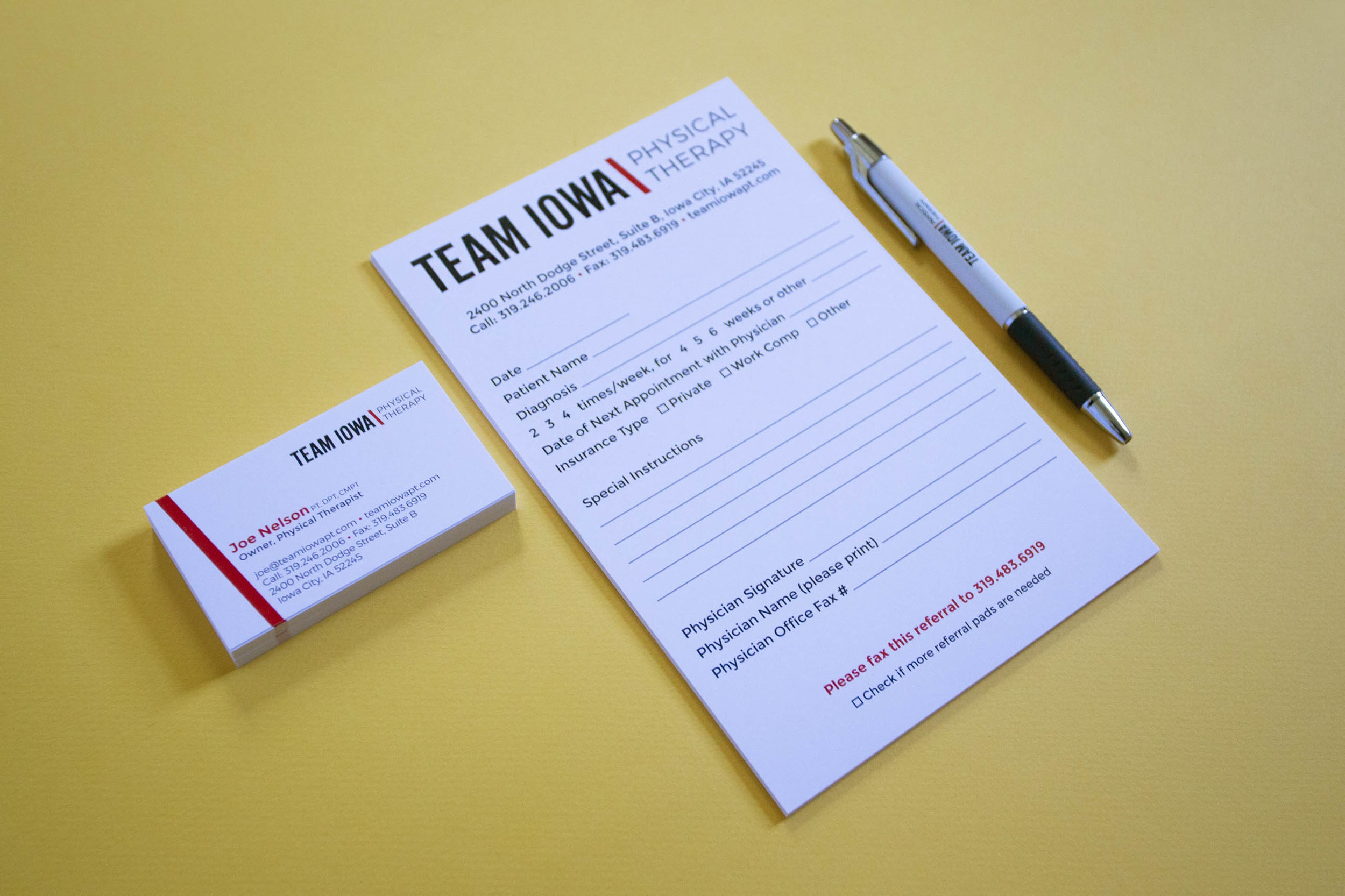
Business cards and patient referral forms.
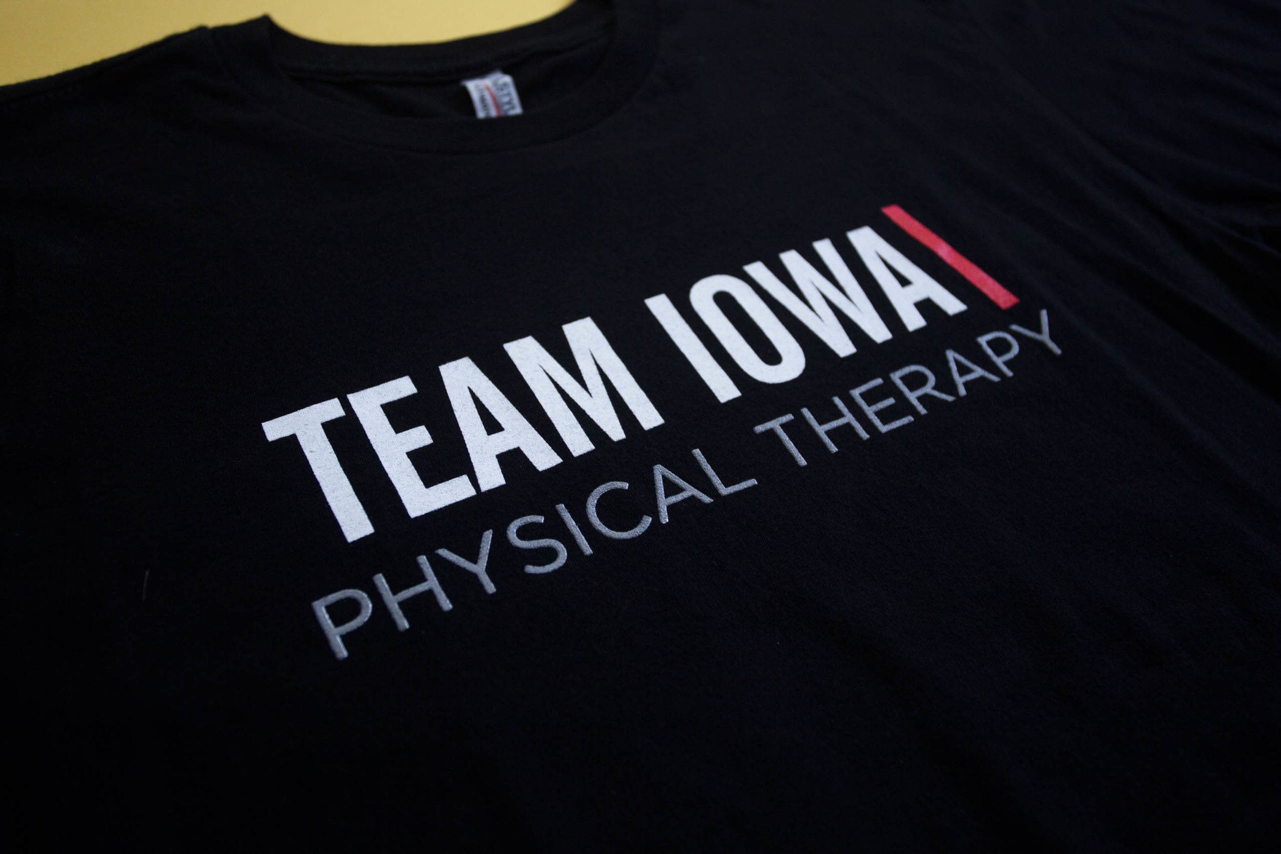
The Team Iowa logo printed on a t-shirt. I am always delighted to spot someone out and about sporting a Team Iowa shirt—both because I love seeing my work out in the world and because I know they are in good hands!

Social media graphics created for the official launch of the Team Iowa brand.
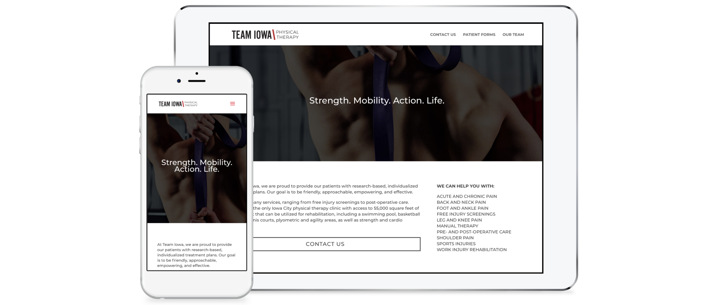
We developed a simple, responsive WordPress site for Joe using Divi.
